Women have more options in the presentation folder game than they might think. Whereas women in the past may have lived the expression “never enough hot pink,” modern women have mostly shed these stereotypes with a sophisticated and original aesthetic of their own—especially in the workspace.
It’s true that gender has become more inclusive to all, and while design elements named traditionally “girly” can double as genderless, there are several timeless feminine folder designs that show you’re in touch with your powerful, yet softer side.
Incorporate elegant typography
If you’re feeling a little diva, an exotic font can speak loudly while saying little. On one side, fonts like Old English and Slab Serif use thick strokes and often have jawline-sharp edges; on the other, cursive and bubbly fonts flip the script by offering curves, frilly lines, and tails that come in handy when daintiness or fineness is needed. Different color fonts can achieve the same feminine effect, whether you opt for light blue or continue with that certain flashy derivative of red.
Add the perfect picture
Nothing says picture perfect ending like a folder with wedding photos displayed on the front cover. Whether you’re capturing a bride and groom, your best glamor shots, or a nature scene, choosing high-definition images will make any message you attempt to convey more pronounced.

Treat it like a blank canvas
Visible from a mile away, artistic folder designs are an eye-catcher to weary co-workers shuffling along the office hallway. Opting for traditionally feminine artworks, either from individual artists or a woman-centric business, can mark you as an ally to women in the arts while also supporting a worthy cause. Other design elements could include a quote from the artist for emotional depth and tab for discrete social plugging.
Select a pastel palette
Without a trace of hot pink, this design tip relies on muted shades and warm-toned colors for its touch of femininity. Pastels evoke a sense of serenity, forgiveness, and understanding: a promise that everything will be okay, so here’s a pillow. Paired with a subtle design and gentle message, pastels are great for non-profit organizations and charities looking to display an aura of calmness.
Add Floral Elements
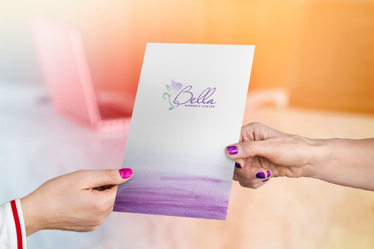
Today’s designs confirm that flowers remain a quintessential feminine aesthetic, and presentation folders are no exception. A well-crafted floral design can be adapted for various purposes, from celebration to mourning, and recovery. Whether used as a subtle background element or integrated into the logo, flowers offer a wealth of creative possibilities and often become the focal point of the design.
Take this digitally printed presentation folder as an example, featuring a beautiful, delicate floral illustration. The result is a serene yet powerful visual identity that perfectly embodies the essence of the women’s center it represents.
Declutter with plenty of white space
What’s “in” nowadays, particularly across homemaking, is neutral colors, basic shapes, and a whole lot of minimalism—which in the folder design world, translates to a spaced-out design with ample white space. Adding a simple black band with the company logo, for example, focuses the recipient’s attention; a crisp white background makes that one design element pop even more, while also decluttering the area. This design is perfect for “current-on-the-trend”-millennials, particularly in the fashion industry.
Opt for tactile finishes
You’d be forgiven for thinking the only feminine texture to coat a folder was, you guessed it, a touch of glitter. There used to be few options to enhance your touch experience, but today, many folder customizations include embossing for a bejeweled-looking logo; laminating for a soft-touch feel that invites attention; and even sleek, metallic coatings that reflect the glamor of the fashion world—or any world needing a bit of glitz.
Emphasize curves
Curves, the scandalous cousins of lines, tend to loop or sway while creating soft repeating patterns, and so aesthetically, they lean on the feminine side. While lines create hard-edged shapes like triangles and squares that often box out a design, looping curves encourage plenty of eye travel and promote a natural flow.
Leave an impression
Even though everyone has their own idea of what makes a strong impression, this tip isn’t completely subjective. In fact, instructions for what to include could not be clearer: it should be unusual, powerful, and informative. Try a custom die cut shape, a striking neon color palette, or a graphic that spans the entire cover.
To wrap things up
While these feminine-inspired folders should inspire a few ideas of your own, this is by no means an exhaustive list of examples. Mixing and matching concepts from each example could make a list-worthy folder in and of itself, or you could opt for a ready-to-go template. Either way, incorporating femininity into your design has never been easier.