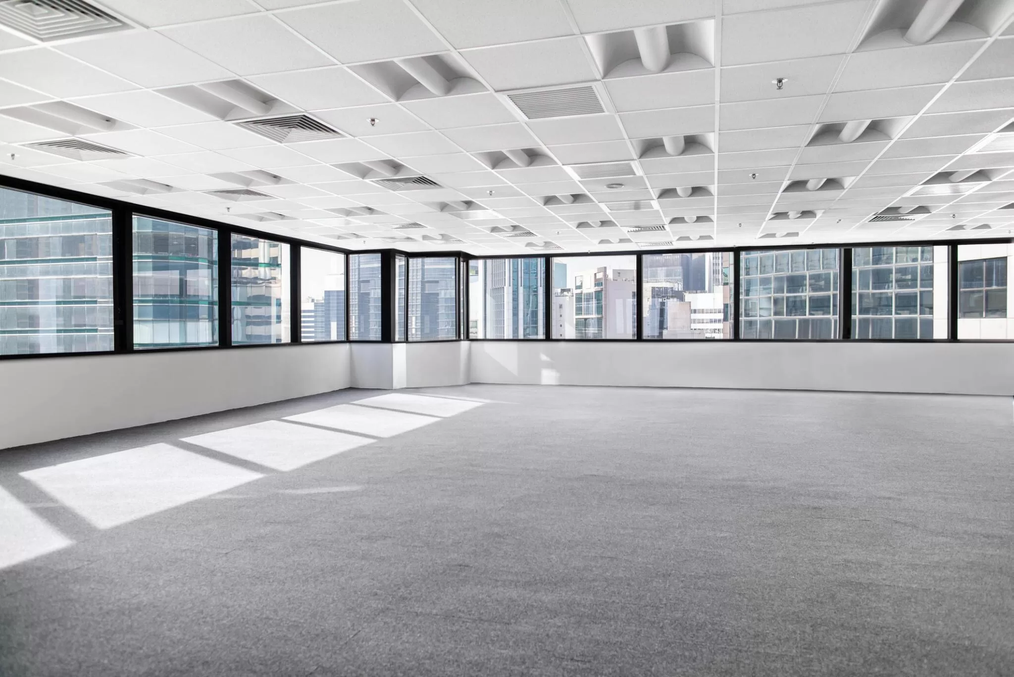
In the dynamic field of commercial interiors, carefully considering each detail becomes crucial in crafting spaces that reflect purpose and style, including the colour selection of commercial rugs. Whether it’s the strategic organisation of elements in the design or the thoughtful choice of furnishings, every aspect plays a pivotal role in defining the overall atmosphere of a commercial setting. However, among these, the choice of colour in retail rug selection emerges as a particularly crucial factor. Functioning as a subtle conductor, it can significantly impact the ambience and psychology of the surroundings.
Beyond merely contributing a visual dimension to the overall aesthetic, the colour of a rug can elicit distinct emotions, establish the mood for interactions, and improve the practicality of the space. Therefore, within the intricate choreography of design, the choice of colour for commercial rugs emerges as a transformative influence, blending seamlessly with other elements to shape an environment that articulates the distinctive identity and purpose of the space.

The Power of Colour Psychology:
Colour functions as a globally understood language, surpassing cultural and linguistic boundaries to connect with our emotions and shape our perspectives. In commercial settings, a crucial aspect is comprehending the psychology behind choosing colours. This understanding plays a central role in designing spaces harmonising with the desired ambience and purpose, ultimately impacting customer experiences and moulding brand identities. Using colours strategically can elicit particular emotions, boost productivity, and direct consumer behaviour, establishing it as a potent instrument for businesses to convey their messages effectively.
- Blue for Serenity and Trust:
Contemplate integrating shades of blue in spaces where a serene and reliable ambience is sought, such as waiting areas or conference rooms within offices. Blue is linked with stability and professionalism, rendering it a superb option for commercial environments.
- Green for Balance and Harmony:
Green symbolises balance and nature, rendering it appropriate for environments that emphasise harmonies, such as wellness centres or collaborative workspaces. This colour can alleviate stress and establish a revitalising ambience, fostering a positive work environment.
- Red for Energy and Vitality:
In spaces demanding energy and stimulation, like restaurants or fitness centres, consider infusing red accents into rugs to enliven the environment. Red is recognised for elevating heart rate and instilling a sense of urgency, making it a fitting choice for areas that promote activity and dynamism.
- Neutral Tones for Versatility:
Neutral beige, grey, and taupe provide versatility and a timeless aesthetic, making them well-suited for diverse commercial settings. These tones establish a neutral foundation, allowing other elements in the space to stand out and contribute to an inviting and sophisticated ambience.
Practical Tips for Colour Selection:
- Consider the Purpose of the Space:
Identify the primary function of the commercial space to determine the appropriate emotional tone. Waiting areas may benefit from calming colours, while creative spaces embrace more vibrant hues.
- Account for Lighting Conditions:
The impact of colour can vary under different lighting conditions. Consider the natural and artificial lighting in the space to ensure the chosen rug colour maintains its intended effect.
- Balance Boldness with Restraint:
While bold colours can make a statement, be mindful of balance. Incorporate vibrant colours selectively to avoid overwhelming the space.
Conclusion:
Within the complex weave of commercial design, the psychology of colour is crucial in shaping environments that connect with occupants. Meticulously choosing rug colours can elevate the overall experience, impacting emotions and reinforcing the space’s intended purpose. Grasping the psychological nuances of each colour empowers designers and business owners to craft a narrative that resonates with the hearts and minds of those who step into the environment.
